
Frame Aviation
Overview
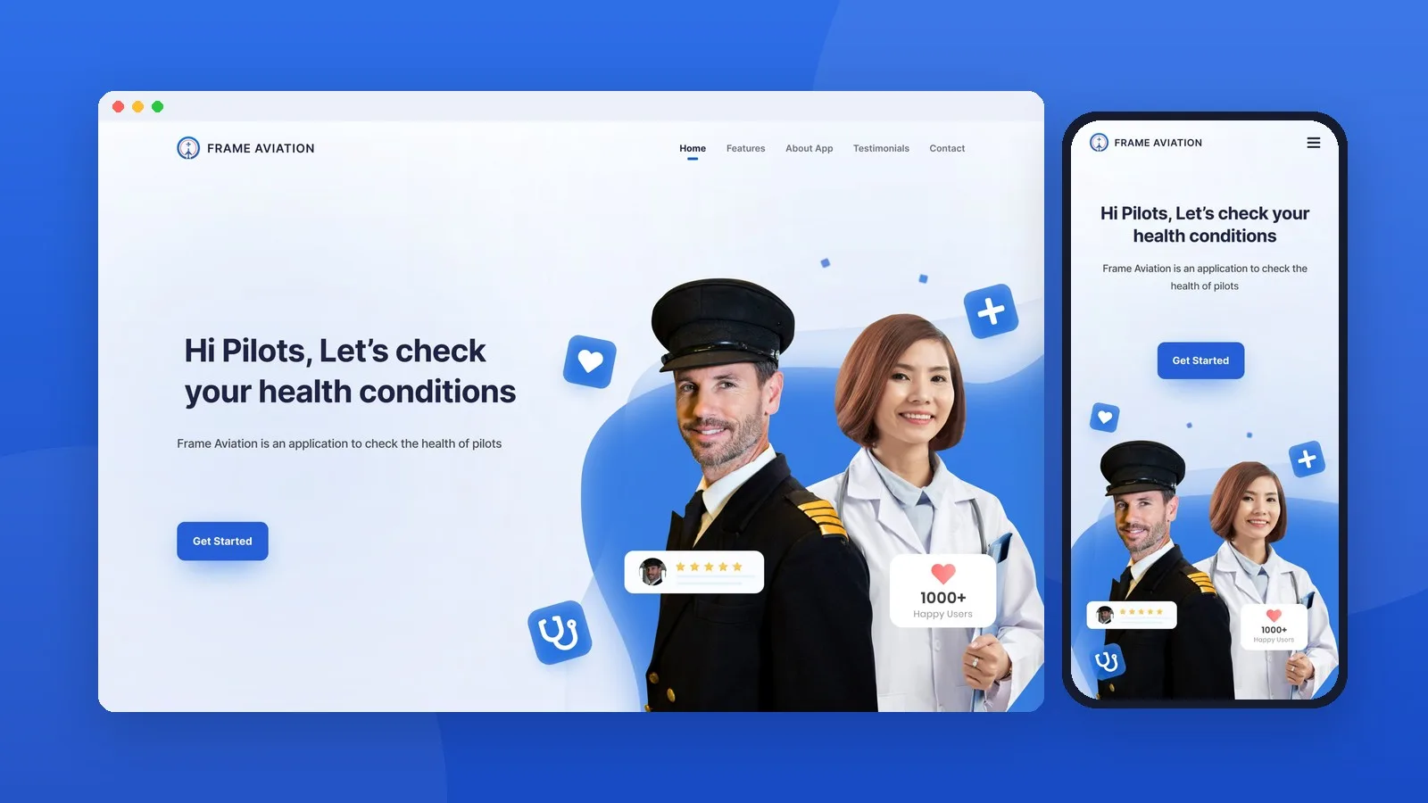
Frame Aviation is a mobile app that helps pilots check their health through short, structured questionnaires. The app needed a landing page that could explain its purpose quickly, build trust with a very specific audience, and guide visitors to download it.
We designed a responsive landing page for desktop and mobile that presents the app as friendly, credible and easy to start using.
Project at a Glance
- Type: Landing page, UI design
- Platform: Responsive web (desktop & mobile)
- Audience: Pilots and aviation health professionals
- Production Year: 2020
The Challenge
Pilots are busy, and health checks can feel like a formality. The page had to show at a glance why the app matters, explain its three features without overwhelming the visitor, and feel credible enough for pilots to trust it with their health. All of this had to lead to one clear action: downloading the app.
Design Approach
A calm, trustworthy palette
We built the visual language around a confident blue with plenty of white space. Blue reads as reliable and medical without feeling clinical, and the soft gradients keep the page light and approachable.
A hero that speaks directly to pilots
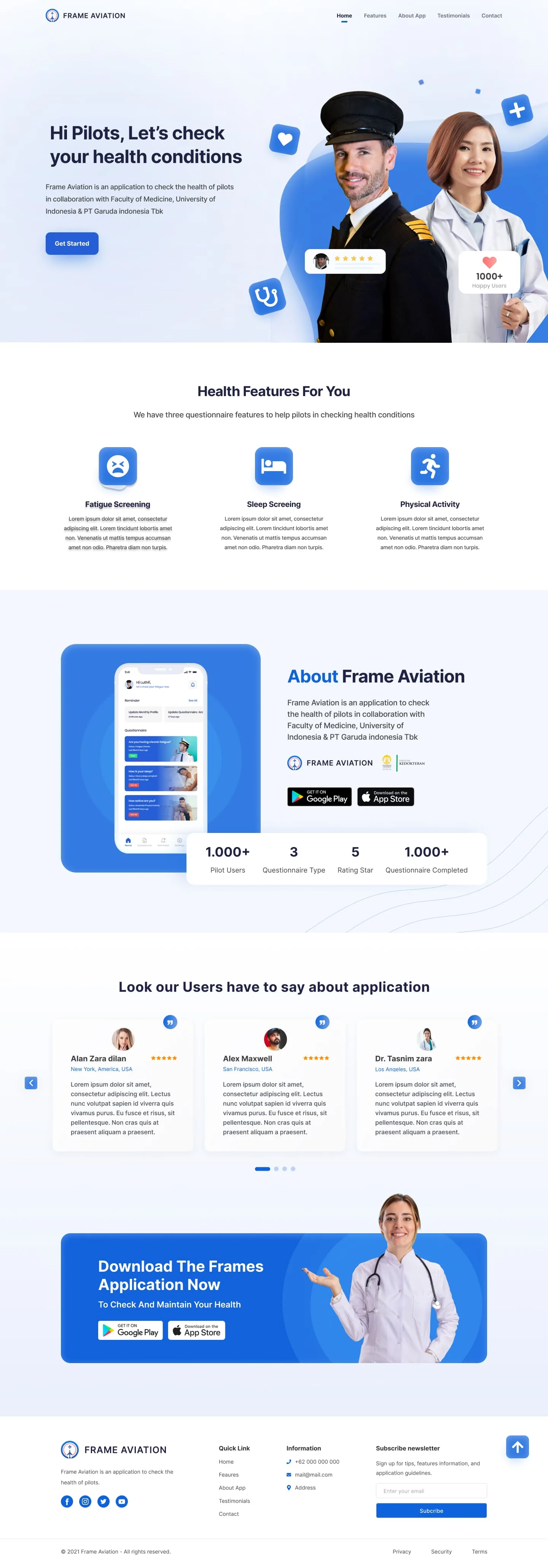
The headline "Hi Pilots, let's check your health conditions" addresses the audience personally. Photos of a pilot and a medical professional side by side capture what the app is about: aviation and health working together. Floating icons (a heart, a stethoscope, a rating card) add movement and hint at the app's purpose before the visitor even scrolls.
Three features, one glance
Fatigue Screening, Sleep Screening and Physical Activity are each presented with a simple icon, a short title and a brief description. The three-column layout lets visitors take in the whole feature set in seconds.
Showing the product, not just describing it
The About section places a real app screen inside a phone mockup, next to the store badges and a stats bar. Visitors see what the app looks like and how many people already use it.
Social proof and a clear call to action
A testimonial carousel lets users speak for the app. A bold blue download banner then repeats the main call to action with Google Play and App Store buttons, so visitors who are ready to act never have to scroll back up.
Page Structure
- Hero: personal headline, short description and a "Get Started" button
- Health Features: three questionnaire features explained
- About the App: product preview, store links and key stats
- Testimonials: a user review carousel
- Download CTA: a final push to install the app
- Footer: quick links, contact information and a newsletter sign-up
Designed for Mobile
Most pilots will visit the page on their phones, so every section was adapted to a single-column layout. Feature cards and stats stack vertically, and the testimonials become a swipeable carousel. The navigation collapses into a full-height slide-in menu with large, easy-to-tap links.

Closing Thoughts
The Frame Aviation landing page turns a serious topic, pilot health, into an inviting first impression. With a clear hierarchy, a trustworthy look and well-placed calls to action, the page helps pilots understand the app in seconds and take the next step toward looking after their health.
Kalau Anda kirim export desain dengan resolusi lebih besar (misalnya 2x dari Figma), saya bisa langsung menyiapkan gambar-gambarnya dan thumbnail-nya.
Bumiku
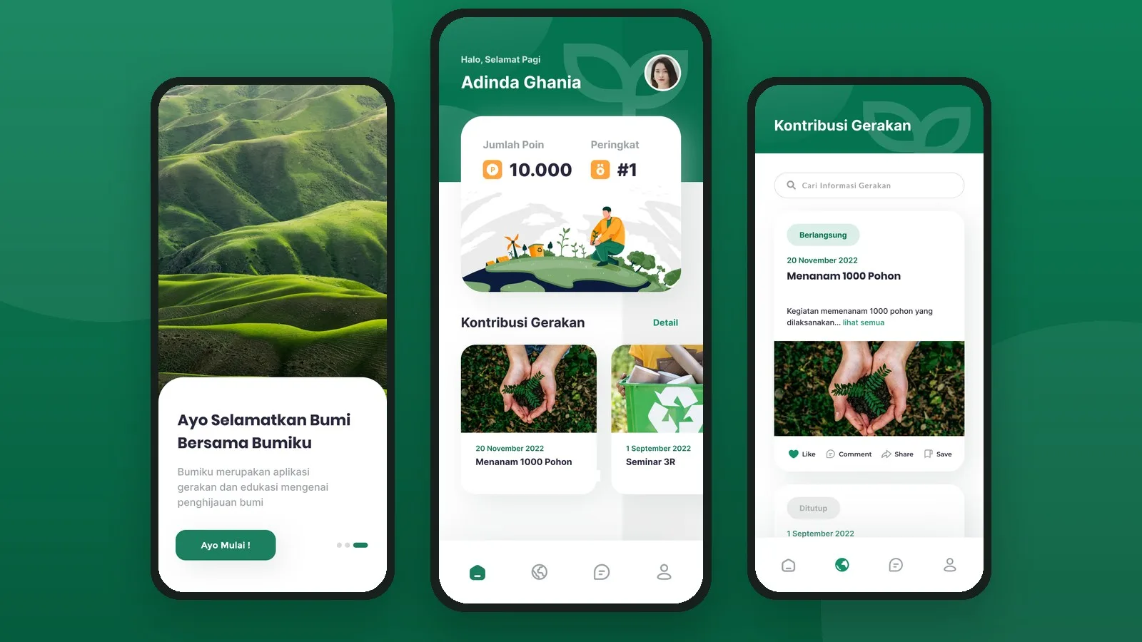
A mobile app design that turns environmental care into a community effort: join green movements, learn through bite-sized content, connect with other volunteers, and earn points you can redeem for rewards.
Panenku
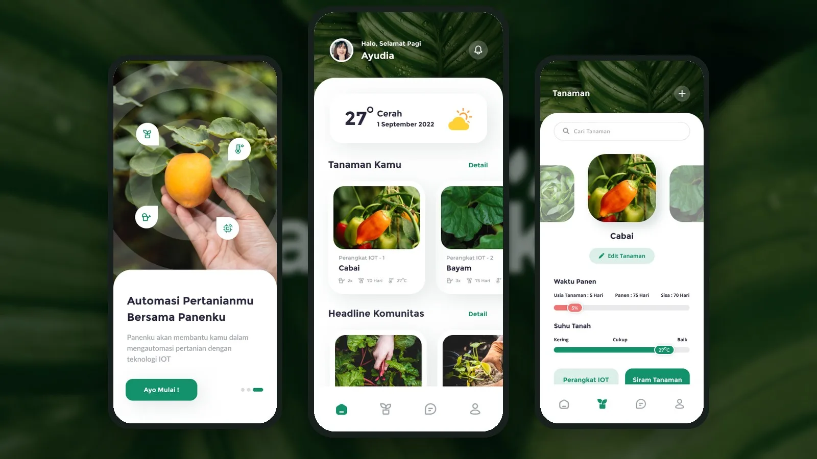
A smart farming app design that connects farmers to IoT devices, so they can monitor soil conditions, track harvest times and water their crops automatically, all from their phone.
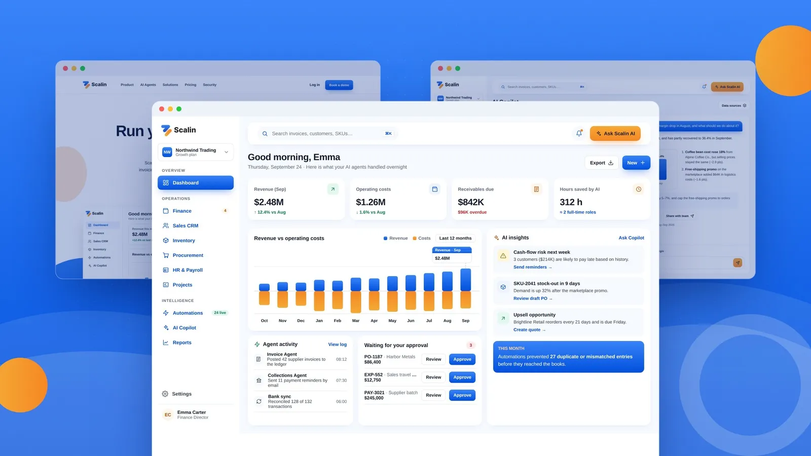
Scalin
A product redesign of Scalin, an AI-powered ERP and CRM platform that automates back-office work for growing businesses, cutting costs, saving time and reducing errors across finance, sales and operations.
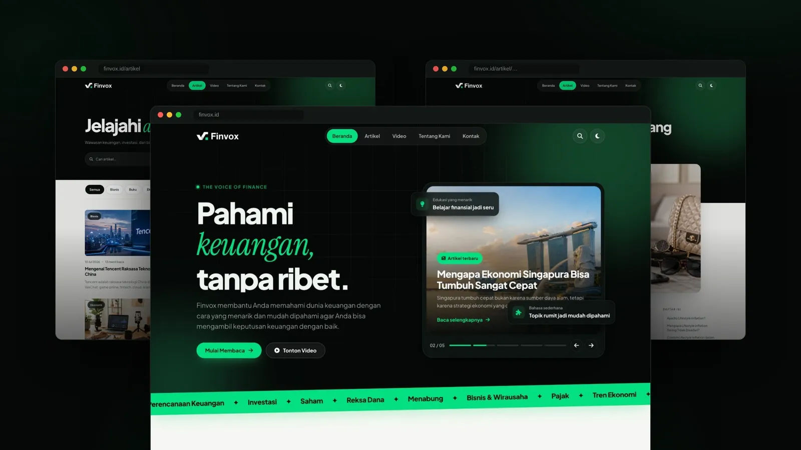
Finvox
A financial education media website that makes money topics easy to understand, with in-depth articles, short explainer videos and clear categories covering finance, investing, business and the economy.